If you want to skip to the map on mobile, click here.
This 10’8″ long ribbon map (or strip map) of the Boston Marathon route was made to be printed on 2″ wide receipt paper. Continuing what has become a minor exploration of impractically long maps: this was the most challenging one yet and combined the limitations of the previous two ribbon maps I’d made. It had to work within the same high-contrast, greyscale limitations of the Wakulla River receipt map, while packing way more information onto a narrower layout than even the Suwannee River map had. I also wanted to get away from rivers and explore some other kinds of linear features, and when I first started this, the 2024 Boston Marathon was only a couple months away. But I moved states shortly thereafter and didn’t finish it before the April 2024 race. Thankfully, the marathon route changes infrequently, and with any luck this map will continue to be accurate for future races.
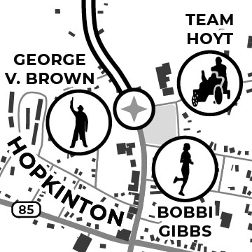
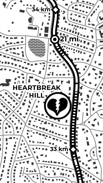
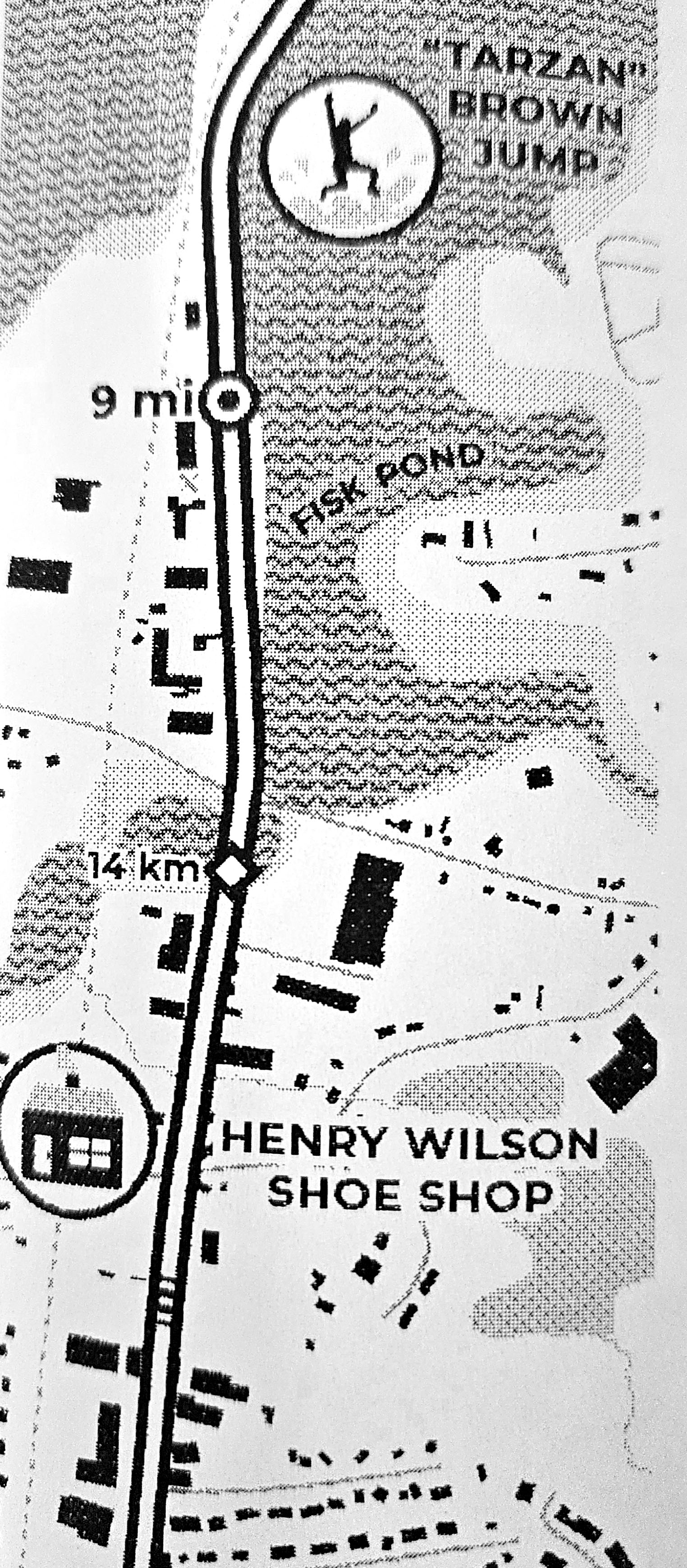
I have never ran in the Boston Marathon and have no intention of ever doing so. I did run cross country in high school, but that was enough long-distance running for my lifetime. But, I was interested in the history and legacy of such a long running event, and after some initial research, I thought that the race had some unique and interesting geography which would make for a fun map. Places like Heartbreak Hill, where Johnny Kelley goaded Ellison “Tarzan” Brown with a playful shoulder pat, and ended up losing because of it. Or the Wellesley Scream Tunnel, where cheers of encouragement from Wellesley College students can be heard by runners more than a mile away. There are also a number of landmarks along the course that can help runners gauge how far along they are, including the iconic Citgo sign near Fenway, the sharp turn at the Newton Firehouse, or the many statues commemorating past icons of the race. Runners like Stylianos Kyriakides, Bobbi Gibbs, or Kathrine Switzer; and supporters like George V Brown or Spencer the Dog. I tried to include as much of the iconic history of the race as I could with hand-drawn markers at the locations of these landmarks and moments, and I relied on various articles, documentaries, and online forums to decide on what to include.
While the map is mostly meant to be a novelty, I did want to give it some practical function. Back when I ran cross country, I was always wanted to know where the uphill sections were so that I could plan where I should speed up or save my energy for an upcoming hill. I fussed with similar ideas of route characteristics while thinking about my previous river maps—for example, showing rapids/shoals or sandbars in the river—but the scale of those maps made them impractical, and there are very few “rapids” in Florida rivers, anyway, even the northern ones. But the Boston Marathon route has plenty of hills, and I was working at a large enough scale that it made sense to show them (which you can see as hatched sections along the route).
I did this by importing the course route (constructed manually from street data) and a digital elevation model of the Boston area into QGIS. I generated points along the route every 10 meters (having settled on this number through trial and error), and created a new line from those points so that I had nice, even route segments to work with. Next, using an elevation profile plugin (qProf), I was able to calculate the slope of those segments, and extract the sections that had a positive slope (positive being uphill, and of course, going in the proper direction that the race is run). However, this left an overwhelming amount of uphill sections, because almost everything on the road is either positive or negative slope in some compacity (even if imperceptible to us). Virtually nothing is perfectly flat. So I did a bit of research to find what level of slope is actually perceptible to runners (about 1% incline, apparently, and if I manage to find the study again I will link it here), then filtered out anything of lesser slope, as well as consecutive segments below a certain length (otherwise every speed table and raised intersection would be included as a short hill.)
Most of the data comes from the USGS, the US Board on Geographic Names, the National Hydrography Dataset, FEMA building footprints, and USDOT roads, though I did manually draw in golf course holes and fields for baseball, football, and soccer, along with a few missing local parks I found. I also added or removed building footprints whenever I noticed one missing, though I promised myself I wouldn’t be obsessive about it. There were far too many buildings to check, and so, though it pains me, I’ve left them mostly as-is.
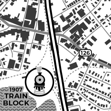
Fine tuning the various shades of grey took some trial and error, though it can be refreshing in a way to have such limited color choices. I stuck with just 10 values (10% black, 20% black, etc.), but as I talked about a bit with the Wakulla map, the printer only mimics greyscale using intricate patterns of dots and crosses, and what looks like good contrast on the screen can look entirely different on the paper—especially when working with thin or detailed features like streams or roads. On the other hand, receipt printers don’t need ink, the paper is cheap, and they print fast! So with my printer on a shelf directly next to my computer, I could print small sections of the map almost immediately as I was editing and quickly figure out what contrasts worked well together on different features. I also printed a little cheat sheet for myself with a grid of all the shades I was using, along with various line widths and text sizes, to see how readable things would be on paper vs the computer screen—but ultimately, it always depended on the shape and size of the feature and whatever it was bordering. Generally, light shades only work well when printed over large, solid areas—otherwise the fine dots are unnoticeable—and smaller features like the buildings need to use the darker shades (70-100% black) to stand out.
Part of the reason I chose to map a race course was that I wanted to make use of an enduro (motocross racing) “route sheet” holder I had purchased, following a comment and suggestion on the Wakulla River map from Eric Seitz (thanks!). These holders are made to display race directions and distances on long rolls of paper, helping drivers follow the course and gauge their progress. They use an old MapQuest style, turn-by-turn set of directions rather than a visual map (though maybe a map layout like this could be useful?) It only felt right to design a race map to test it.
When I was fiddling with the wind-up container for the Suwannee River map, I initially toyed with something closer to this route sheet holder in Blender, inspired by some of the old analog GPS-predecessor maps I’d seen for cars and wristwatches. But I ran into trouble finding the right angles and leverage to make things turn smoothly, and while I might have gotten there eventually, I couldn’t pass up on one of these nicely machined sheet holders up for just $30, figuring it was worth it just to prove the concept. Eventually I’d still like to finish my own design with some modifications and 3D print it, but that’s a project for another day.
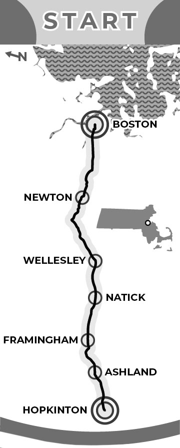
I finished off the bottom of the map with a legend, title cartouche, and a small overview map of the race—which shows the true shape of the course. I briefly wrote about straightening out the data manually for past maps, and this one was particularly challenging giving the density of streets and buildings around Boston. I had to make many more cuts and do a lot more manual finessing of features than before, but it went relatively quick with all the practice from the last two.
Finally, if anyone wants to strap one of these to their wrist and run the Boston Marathon with it, I’d be happy to share the file. Your local CVS Pharmacy would probably be giddy to print it out for you.
This map was the winner of the 2024 CaGIS Map Competition “Other” category. It was also featured at the 2025 International Cartographic Exhibition and can be found in the map collection at the Norman B. Leventhal Map & Education Center of the Boston Public Library.
