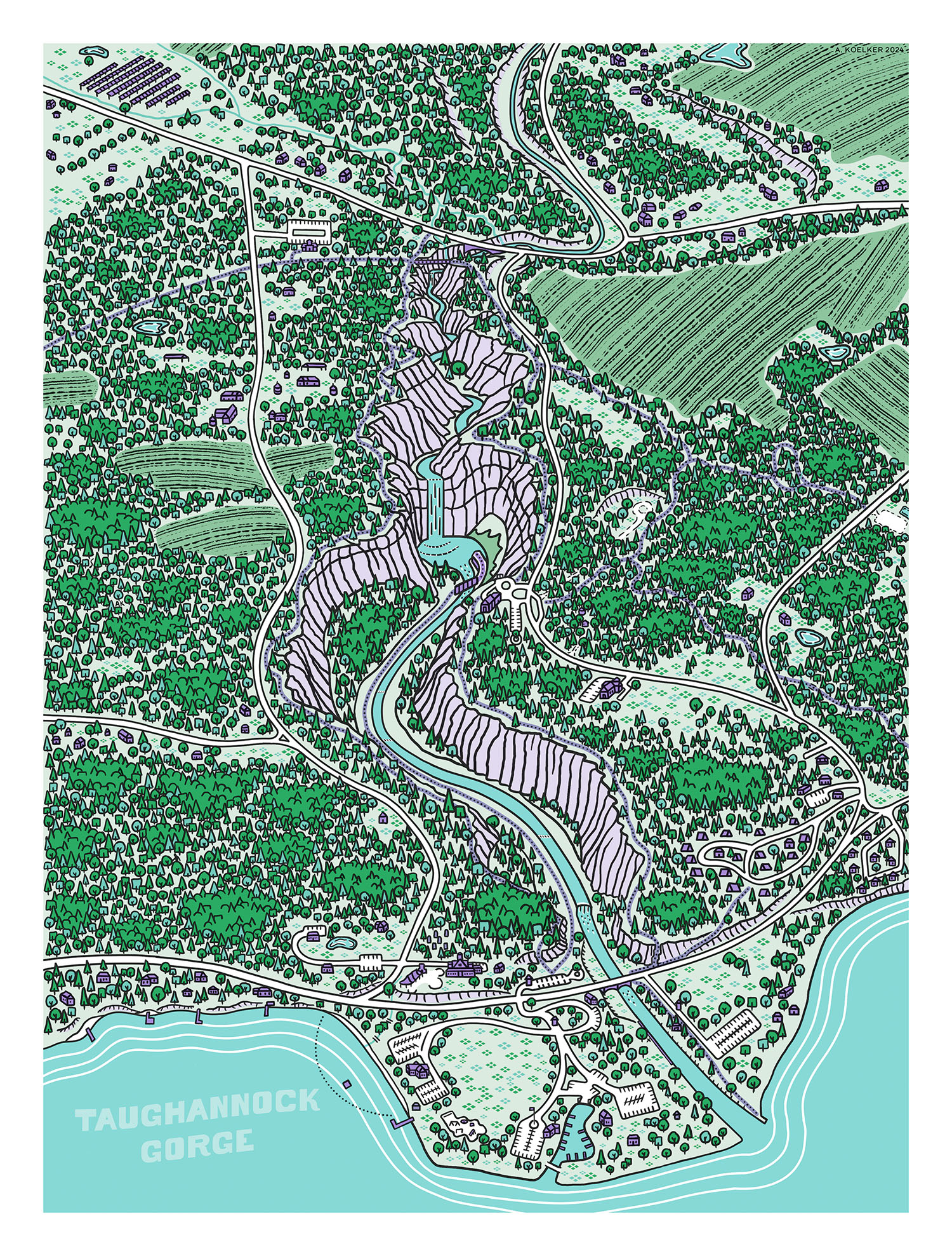
This map(?) of Taughannock Gorge, located in the Finger Lakes region of upstate New York, was drawn with the Procreate app on iPad and printed on a risograph. A risograph is sort of a hybrid of between a photocopier and screen printing. Like photocopiers, they have a scan bed on the top (though I didn’t need it in this case) and can print off pages fast. Like screen printing, they only print one layer of color at a time, and do so using a master sheet that’s been thermally perforated with a bunch of tiny holes. The ink then gets forced through the holes of the master and onto the paper as it’s fed through the machine. Different values of color can be obtained with more/less and bigger/smaller holes, and when you start layering different colors on top of one another—you can get a pretty wide range of hues. The “downside” is that the alignment and registration between layers can be imperfect, but that’s also part of the risograph “look”.
I made a map of waterfalls around Ithaca NY earlier this year which took partial inspiration from risograph textures, albeit recreated digitally. Then, I found out there’s an awesome shop right here in town called Ithaca Print Commons, which has risograph machines open to community use. After joining a workshop there and learning what the printers could do, I wanted to create a map (which became more of an illustration) that had the specific functionality and limitations of a risograph printer in mind.
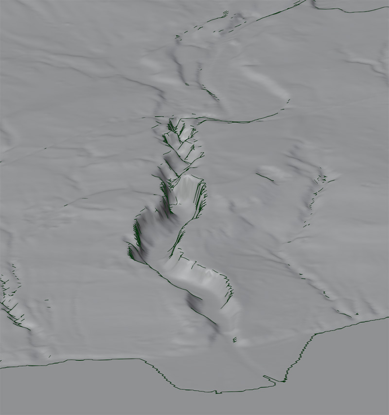
I started with some elevation data (USGS 3DEP) and Blender to generate a 3D reference model. I used an isometric perspective as a guide, though by the end I had strayed away from it quite a bit (it’s actually two different perspectives blended together, and some fudgery around the main waterfall to place it more clearly into view). I referenced a lot of aerial imagery using Google Earth, as well, though next time I would just drape imagery over the Blender model and save the headache of trying to mentally transpose between multiple perspectives. Here’s one of the perspectives created in Blender, along with a Grease Pencil object to help highlight sharp edges.
Between the workshop, YouTube, and some trial and error—I figured out how I would need to have the digital files arranged for the risograph and kept that in mind while drawing. Each color needs to end up as its own grayscale layer or file. Full black means the printer will print the color fully opaque; white means no ink at all; and grays are for all the various values in between. Things get a little more complicated if you’re trying to combine two different color inks to make a third, but for this project I kept it simple and had no overlapping colors; except for the black, which sat on top of the others but wouldn’t mix. For me, it was easiest to stick with a single color and adjust the layer transparency in Procreate to mimic different values, rather than fiddling with the values at the brush level. So each layer I had in the file was both its own color and own opacity (green 80%, green 50%, green 20%, black 80%, etc.), which made it easy to tweak things as I went.
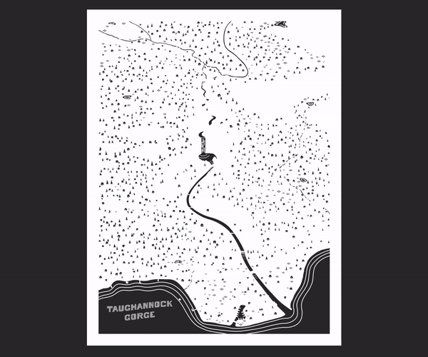
Afterward, I brought everything into Photoshop and merged layers with similar colors, then converted them to grayscale based on their opacity (not value, which is important if you go this route) using the shortcut Ctrl + Shift + Backspace on Windows. This isn’t the same as converting to black and white or using Image > Mode > Grayscale. If you were to do that, you would then need to mess around with the Levels or Curves to make sure that each color is stretched between full black and full white again. In the animation below, you can see each of the four colors (mint, green, violet, black) shows up as grayscale on their own layer, but if you set them up and combine them as spot channels (which isn’t necessary, but neat) you can preview what the final color print will look like.
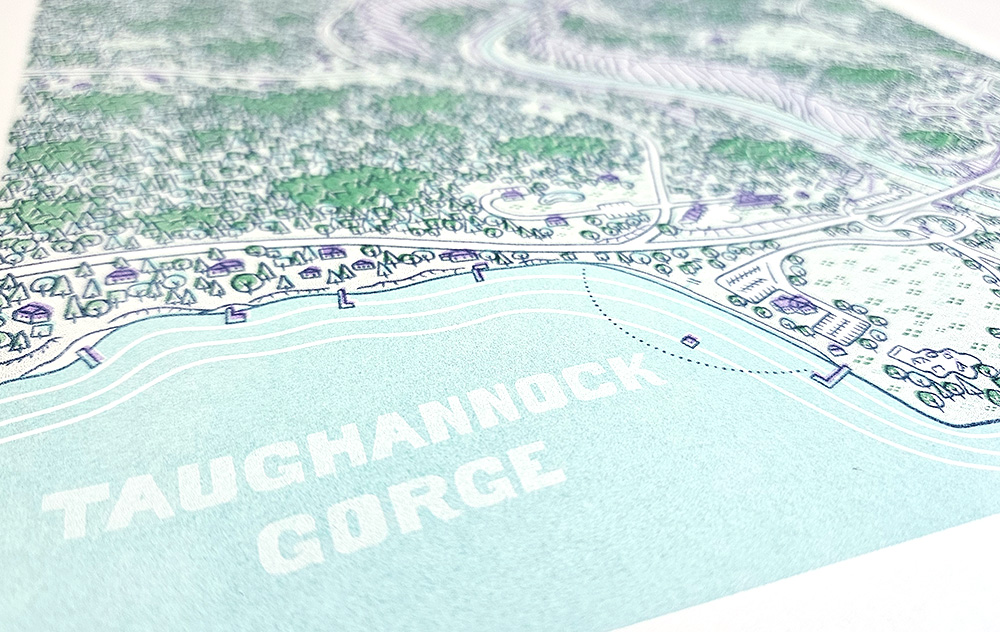
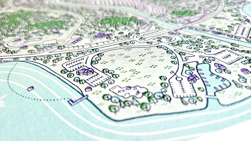
The map is obviously not to scale—with giant buildings, tents, trees, etc.—but I did reference a lot of maps, photos, and different years of aerial imagery (and took a few field trips) to try and make a fairly comprehensive portrait. Nearly every building is included, and the tree density in places is vaguely accurate. I also included the new upper falls trailhead area, which technically doesn’t exist as of this writing, but is under construction and supposed to open in 2025. You might also spot a bigfoot emerging from the trees somewhere, if you look long enough.
Originally, I envisioned this as more of a tourist map with labels for points of interest—but when I went into Adobe Illustrator and started adding them in, they needed to be a certain size along with halos for legibility and just ended up obscuring too much of the drawing. So I left them out, and in the future would try and plan space for text better. There were a couple other things I learned for next time as well during the actual printing process (shoutout to Kaleb Hunkele at Ithaca Print Commons for all the help!). A few adjustments I’d make in the future
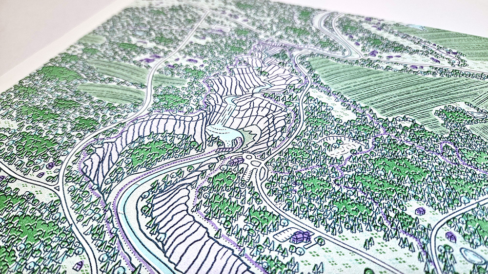
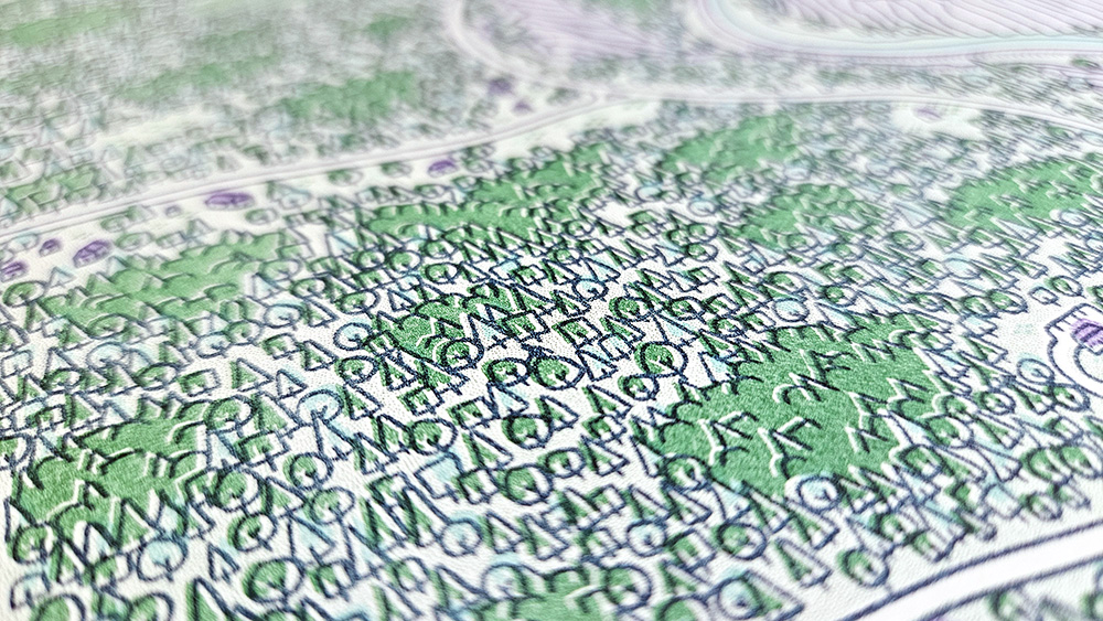
1) Block out your colors when you have darker linework going over top. In my case, I used the Fill (paint bucket) tool with the linework as a reference to quickly color all of my trees. But I underestimated the amount of misregistration I was going to be dealing with, so I was left with tons of erratic white lines in all the forested areas which would’ve looked much better if I had simple blocks of color underneath my linework. Instead, my colors follow the lines for tree trunks, tree tops, etc. You can probably see it in the images below, especially the thick blob of trees in the lower right quadrant. The possibility of this issue didn’t occur to me until I was deep into the drawing, and I while I accounted for it in the violet layer, the green would’ve taken much longer to go back and fix and I was anxious to be done, so I left them alone and figured I’d see what happened. Another method to help with this is color trapping, which is sort of like overprinting, and helps to eliminate white space from misregistration by increasing the size of the colored areas a little bit to compensate.
2) The less colors, the better (or easier). Next time I’ll probably try and stick with two colors, because registration became increasingly complicated with each layer. You might have one color layer a little too far to the left, another a little too far right, and then at the third color you’re trying to split the difference between the two. Add a fourth color in and forget it. That said, the registration is probably never going to be perfect, and it’s kind of the “look” of risograph, so maybe best to just embrace it. Otherwise, if you want to use three or more colors, perhaps try a simpler design with less registration points—opposed to, for example, ten thousand little trees.
If you want to try making and printing your own risograph designs, check out this cool map of risograph print shops and maybe find one near you!