This map depicts the New York State Park System and its various units (with some caveats), and was made to print on a risograph. Unlike my previous risograph project with Taughannock Gorge—which was hand-drawn—this map was made almost entirely in Adobe Illustrator. I wanted to try a simpler print this time and stuck to two colors instead of four, which made the actual printing part easier. But I didn’t plan out my layers quite as well in Illustrator as I did in Procreate with the Taughannock project, and my initial attempt at organization quickly broke down as I got caught up in the design. Unsurprisingly, this led to more work down the road when I needed to separate everything out again into two color channels. Things like clipping masks, blend modes, knockouts, etc. can be hard to re-organize when they depend so much on specific layer order and object groupings in Illustrator—so note to future self, keep your colors separate and plan your effects accordingly.
Another example: there were places I needed to create duplicate objects in my layers so that I could knock-out areas between colors. For example, if you look at the Canadian cities on the north shore of Lake Ontario, you can see a white, fuzzy outline around the city names. Normally to get this effect you could just put a white stroke with a blur around the orange text and call it a day, but since the green color layer is being separately from the orange I had to actually knock out the green land polygons with duplicate text from the orange layer. The solution isn’t complicated, but it can be tedious to apply all those sorts of fixes after-the-fact.

Another thing I did differently here compared to the Taughannock Gorge print was that I didn’t generate my final two color channels based on opacity. I tried to initially, but figuring out how to make that work with gradients—for example, on the orange borders between park regions—became complicated. The “smaller” lakes—like Lake Champlain, for example—were also troublesome to work with because they needed to cover up land-polygons on both color layers, but not cover any of the labels, which would involve some complex pathfinding given the way my data was setup. So instead, I decided to just go the free-form route and converted each color layer to grayscale in Photoshop afterward (Image > Mode > Grayscale), then fiddled with the Curves (Image > Adjustments > Curves). In the Curves menu, I found it helpful to enable the “Show Clipping” option, then crunch down the black slider as low as it will go without being able to see any marks that show up in the clipping preview. This way, you get a good stretch of values between full black and full white (assuming you have some actual white in your layer). In my case I also wanted to knock down the Output setting in the Curves window from 100% to 90%.
I’d read somewhere that printing with 100% opacity on risograph could cause the paper to stick as it feeds through the machine, but in hindsight I’m not sure it’s worth worrying about. Especially with a map like this, where only the park labels were printing at 90%. They’re so small and sparse that they seem unlikely to cause any stickage. But if you had big solid blocks of color, it may be worth considering.
After converting the two color layers to grayscale, I created two spot channels (still in Photoshop) and pasted each layer into its own channel. From there you can set a spot color for each channel that’s close to whatever riso ink you’re planning to use, giving you a preview of what the final print will look like. I found a handy list of riso ink color equivalents for HEX/Pantone/RGB/CMYK at https://www.stencil.wiki/colors . When you’re happy with the preview, you can use the “Split Channels” option in the Channels window to save each channel to its own PDF file for printing.
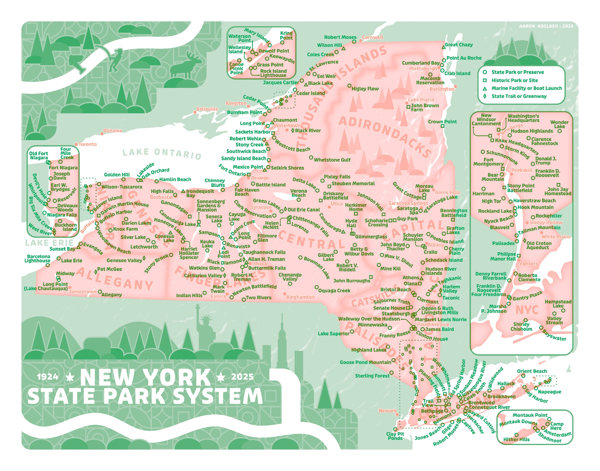
So that’s a bit on how the map was prepared to print on a risograph, but what about the contents of the map? It turned out to be a more complicated of a process than I was expecting. Or at least, I let myself fall into the rabbit hole as I often do, and spent about ten times as long as I should have curating the data.
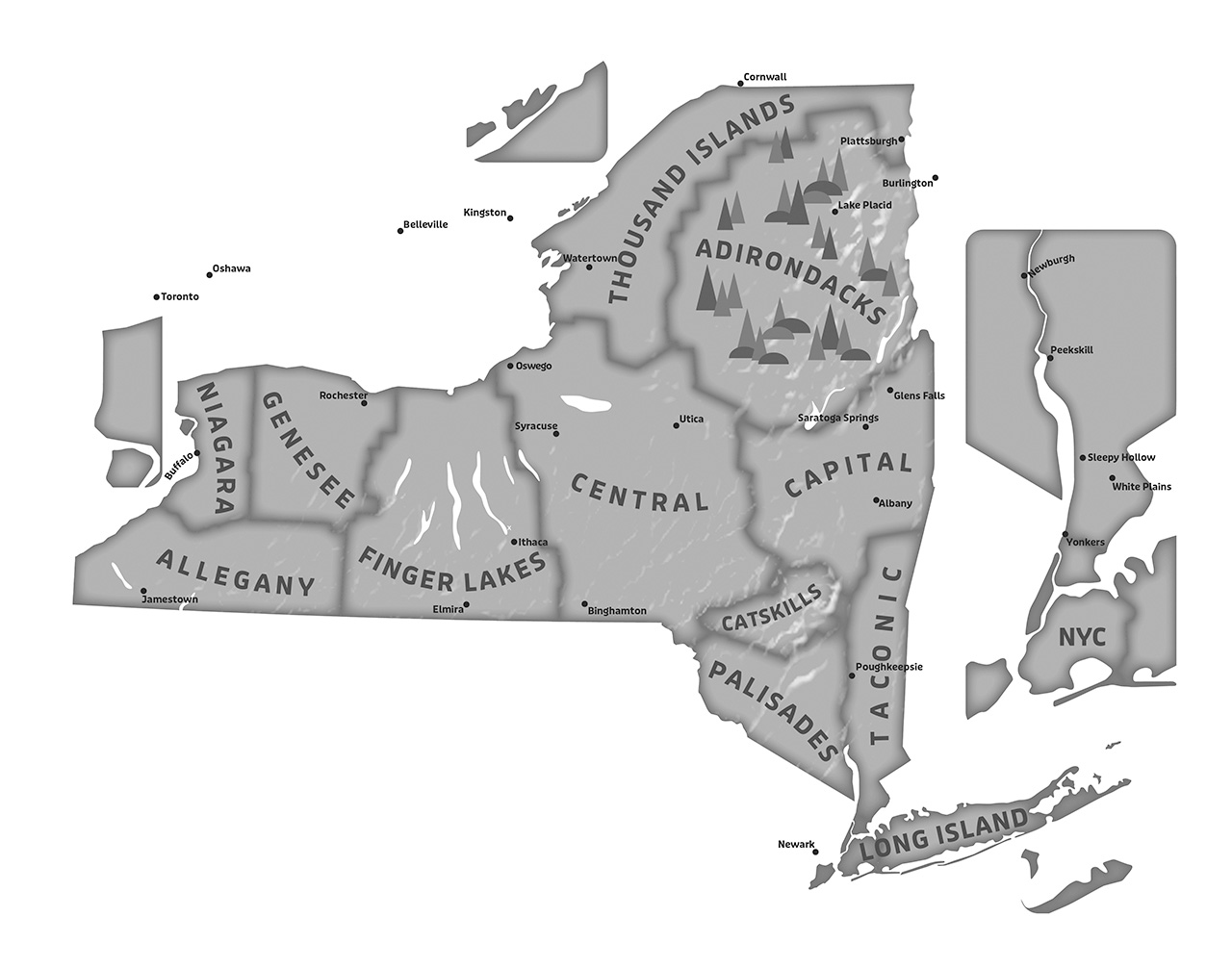
I worked for the state of Florida for eight years and often with the Florida State Park System itself for various GIS needs, so I’m pretty familiar with their data and organizational structure. I always appreciated (even more so now) the consistent naming and organizational structure they had for their park units, including what was considered a State Park vs a State Preserve vs a State Historic Site, etc. There was also very little ambiguity in what was considered a part of the state park system, and that was all reflected in the official GIS data they offered for locations and boundaries. So when I first dove in to the New York State Parks data, that was the sort of clear organization I was hoping to find.
But the New York State Park system appears a bit more loosey-goosey in its organization (to me, anyway). The naming structure seems a little all over the place (I distilled them into four categories for my icons/legend) and there are parks that are technically listed as State Parks within the data and annual reports but which you won’t find advertised as being a part of the park system, even if they’re publicly accessible. There are also places out there with “State Park” in their name that are not actually managed by the State Park system or associated with it in any way, other than that they exist on lands leased by the state. And then there are units like Donald J. Trump State Park, which seems to only exist due to legal obligation at this point, and I get the sense that the state would like to pretend its not there.
So the places that do appear on this map are somewhat subjective—meaning the map is only comprehensive within a criteria that satisfies my own (probably flawed) logic. That criteria includes a few rules I eventually settled on: 1) If it had its own dedicated page on the official State Park website or mobile app, it was automatically included (with one exception that I’ll note later on). 2) It had to be publicly accessible—even if you can only get to it by boat or the “park” is merely undeveloped natural space—it had to be somewhere the general public was allowed to visit. I envisioned this map as something someone might use to make travel plans or check off parks they had visited, so you had to be able to go there. This excluded some places like the Susan B. Anthony Childhood Home in Battenville, which exists on the National Register and was purchased by the state for preservation in 2006, but which is not open to the public and doesn’t appear as though it will be anytime soon. 3) It had to be actively managed by the New York State Office of Parks, Recreation and Historic Preservation. Again, my opinion and expectations are probably painted by growing up with the consistent quality of Florida State Parks (and many visits to the National Park System), but there’s something reassuring about driving up to a park entrance and seeing that consistent branding and signage and knowing you’re going to find a certain standard of quality, safety, and enjoyment within. I’m sure some of these other places that are allowed call themselves “State Parks” are really nice, too—but in my opinion, if you’re not managed by the State Park System or partnered with it in any way, can you really consider yourself a State Park?
One exception that I mentioned earlier, and which I already sort of regret, is that I left off the “State Park at the Fair”. Maybe it’s because I’m a transplant and I just don’t get it, but I’m not sure why this is treated as an official state park. A four acre courtyard around a concrete pool that’s only open for two weeks a year during the New York State Fair, and seems to mostly be an advertisement for other state parks? It felt like it didn’t belong, but I can already imagine my future self wishing I’d included it for completeness’ sake. Ultimately, I went through just about every park one by one, did a little investigating, and made a decision. Things are always changing though, so we’ll see how long this remains “accurate”.

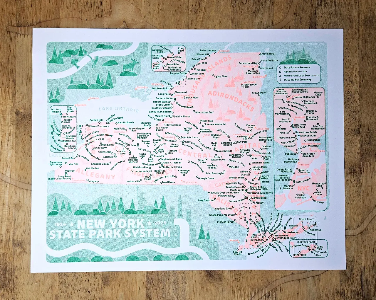
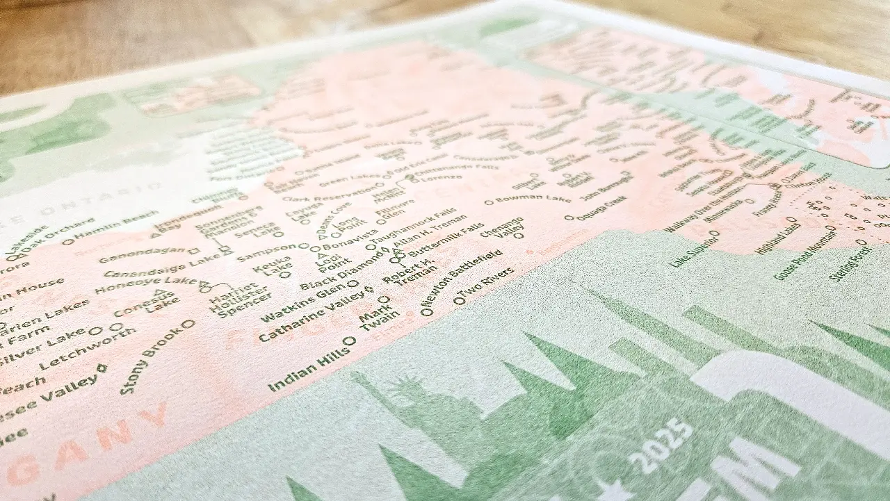
You may have noticed that the digital file at the top of this post is orange and green, while the photos of the actual print look pink and green. I originally planned to use the color “Sunflower”, but the ink cartridge was having problems the day I went to the studio to print, so I went with “Fluorescent Orange” instead, which looks kind of pinkish. I am happy with how it came out, and actually like it more than the orange.
If you’d like to have a copy of this map, I’m dipping my toe into sales. You can find it here: https://www.etsy.com/shop/AaronKoelker