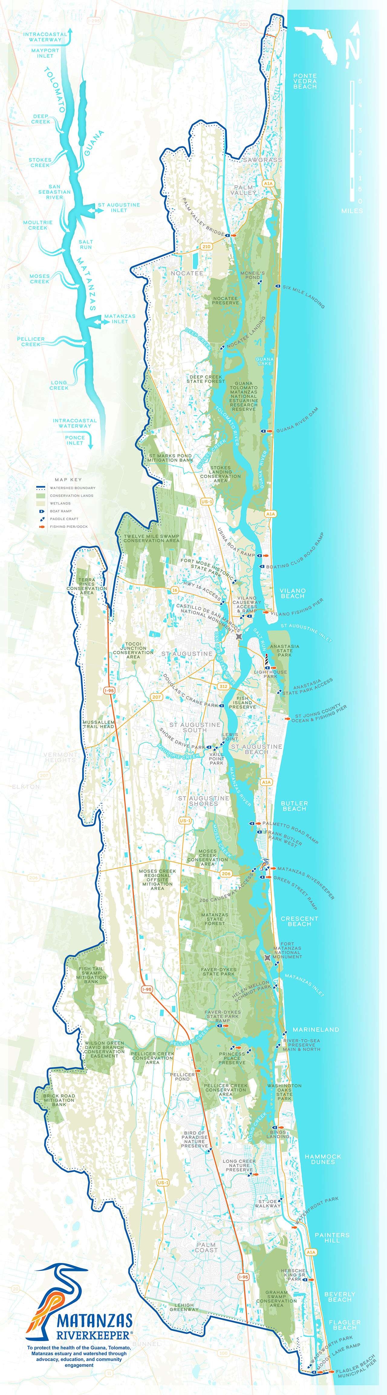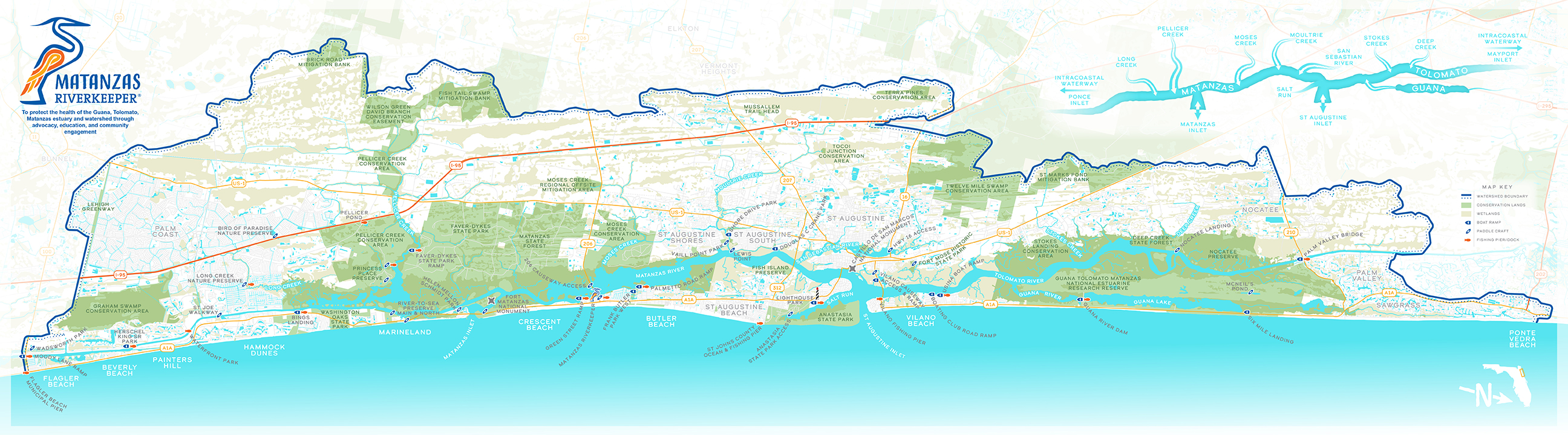
This map was a volunteer project for Matanzas Riverkeeper—a grassroots, non-profit organization dedicated to the health and protection of the Guana, Tolomato, Matanzas estuary and watershed through advocacy, education, and community engagement. The purpose was to have a map of the watershed to display at community tabling events and help engage with residents. The watershed is in and around St. Augustine, Florida, just north of where I grew up and later where I worked for a brief time, and so I was very happy to help. The area contains some beautiful and important natural areas, and I have a lot of good memories visiting places like Washington Oaks State Park, Marineland, Fort Matanzas, and the city of St. Augustine itself. I also worked at the Guana Tolomato Matanzas National Estuarine Research Reserve for a short bit, which encompasses much of the two large green areas you see north and south of the city of St. Augustine (center).
The long, narrow shape of the watershed is challenging to fit in one map, but we knew from the get-go that we wanted to avoid splitting the map up into two different sections, as past maps had done. So we ended up with this similarly long and narrow layout. Because this was meant to lay on a table, we also agreed to have things in a landscape orientation with north to the right. This also helped put as much of the map as possible close to readers standing at the table, and they wouldn’t need to lean forward to see things as the top. Given this is primarily for locals and there’s an easily recognizable coastline, there shouldn’t be much danger of folks getting disoriented by the rotation.
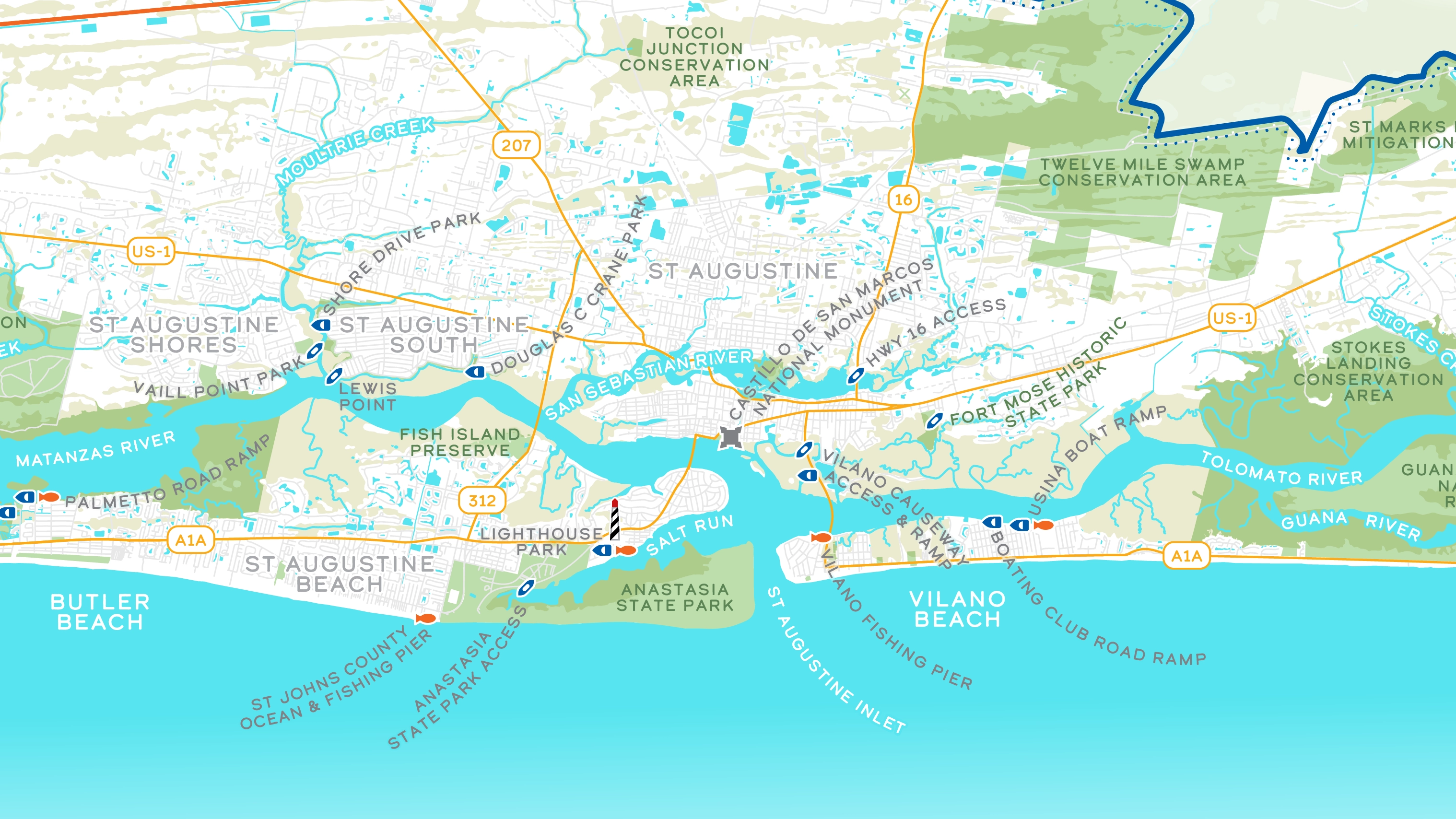
The overall style is borrowed from the Suwannee River ribbon map I had made previously, with additional brand colors incorporated into things like the roads, watershed boundary, and icons. The icons mostly highlight public access points, with a few cultural landmarks for orientation, too. Conservation areas and wetlands are also featured prominently.
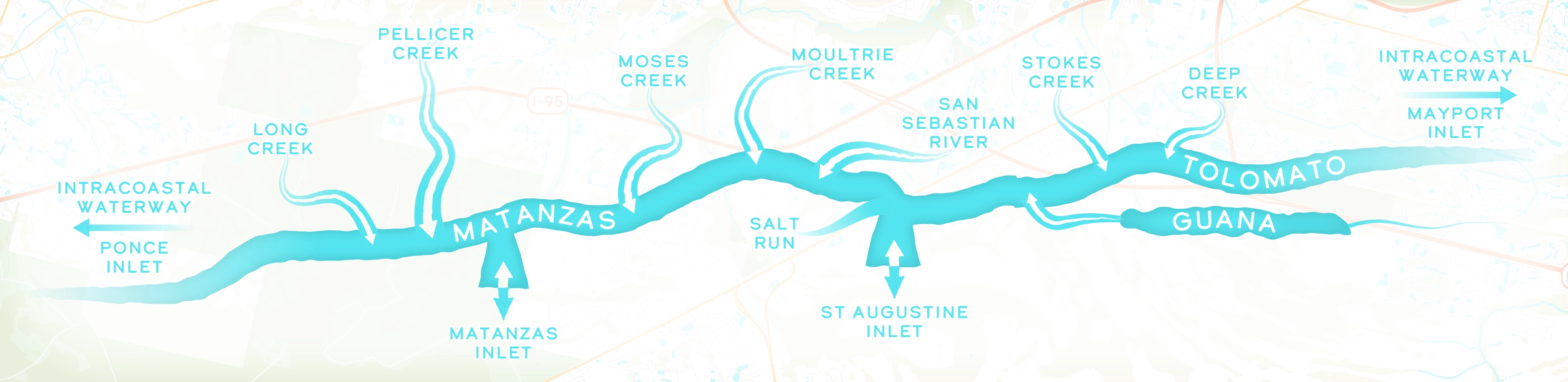
Because of the scale we had to work with, some of the smaller tributaries could get lost in the mix of other features, which isn’t ideal on a map highlighting water. To address both this and a section of unused space at the top right, there’s a generalized water flow diagram that gives a clearer, simplified picture of the network of tributaries in the watershed.
Later I created an additional tall version that could be posted a boat ramps, and fit better into the existing sign boards they had than the horizontal version would. I rearranged all the logos and text to accommodate the new orientation, and moved a couple other elements like the legend and logo. The water diagram needed a bit more work and I had to move the river labels outside of the water, as they were too hard to read using this new angle. A simple scale was also added to the top right corner.