14″ x 8.5″ Hover for zoom
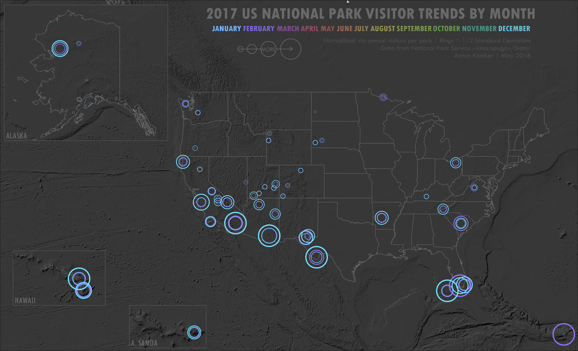
This look and technique was taken from a map by John Nelson. It uses monthly visitor data to show when people are visiting US National Parks, rather than how many. The bigger the ring, the bigger the spike in visitation for that month. Parks with a tight spread – such as Great Smoky Mountains, Grand Canyon, and Channel Islands – experience consistent visitation throughout the year.
I normalized monthly totals against annual totals per park and classified via 1/2 standard deviations. Trying to use gross totals would have been difficult when Great Smoky Mountains sees 11+ million guests annually, and Gates of the Arctic only sees 11k. North Cascades NP in Washington State saw only 6 brave guests in February, whereas GSM had 450k. Animating it into a GIF shows a pattern of folks chasing the weather. If I did it again, I’d reverse the color scheme so that that autumn has the oranges and spring has the greens, as I did for this spin-off map using Florida State Park visitor data.