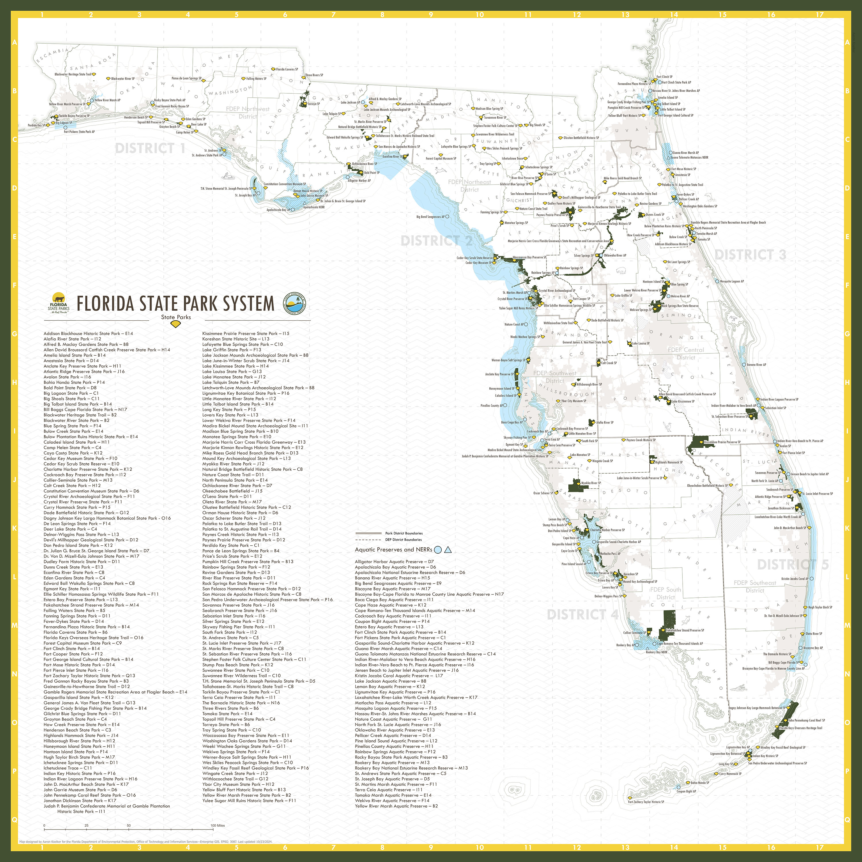
This map is a redesign of a redesign. The original map it was intended to replace felt a bit cluttered with aerial imagery, and was very ink-intensive to print, so I wanted to try to make something that was both clear to read and conservative on ink, as it is a popular print request around the office. Two years before making the version shown here, I made an iteration that was one of the first projects I made using ArcGIS Pro, so it was a helpful exercise in getting familiar with that (at the time) new software. A couple years later, I revised the map (featured here) and did away with the original “heads-up” number system in favor of a reference grid. I also added a new color scheme that was more inline with the modern Florida State Parks branding and made a bunch of other small improvements—including masked labels, beefier borders, and a replacement for the generalized bathymetry using a geometric water pattern that saved on even more ink. Other additions include some subtle reference data like roads, lakes, and urban areas, as well as 9 hidden Florida animal doodles for readers to find, which were all drawn by hand. Good luck finding them all!
The map was last updated in October 2024 to include recent expansions to several parks and two new aquatic preserves.