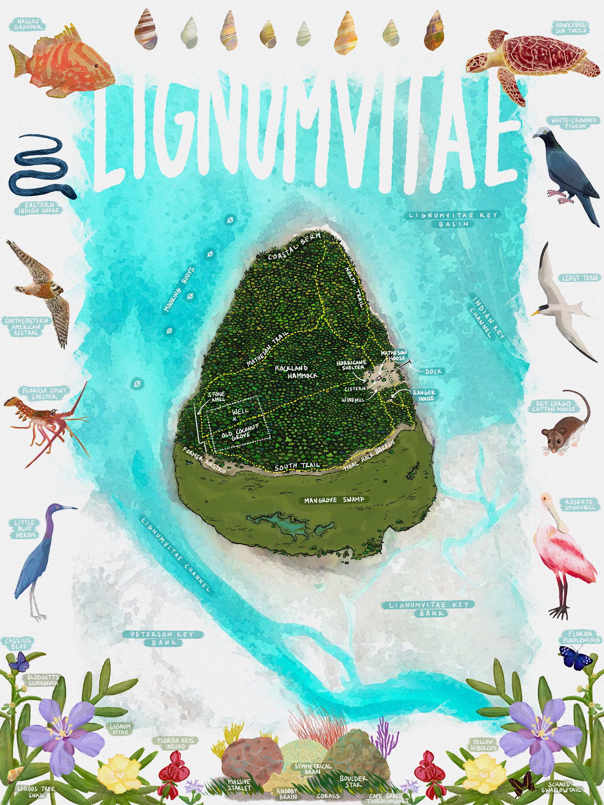
Lignumvitae Key, part of the Florida Keys, sits just north of Lower Matecumbe Key, west of Islamorada. It’s protected as a Florida State Park, surrounded by the waters of the Lignumvitae Key Aquatic Preserve, and can only be accessed by boat.
The island holds some of the last undisturbed, tropical hardwood hammock found in the Florida Keys, which includes the island’s namesake: the lignum vitae tree. Latin for ‘wood of life’, the tree’s incredibly durable wood was harvested for ship building in the 18th and 19th centuries. The island’s distinct guitar-pick shape points almost directly north, and like much of the Florida Keys, sits on top of a limestone block that’s perforated like swiss cheese. It’s also home to a multitude of rare and endangered plants and animals, some of which are depicted around the borders of this map.
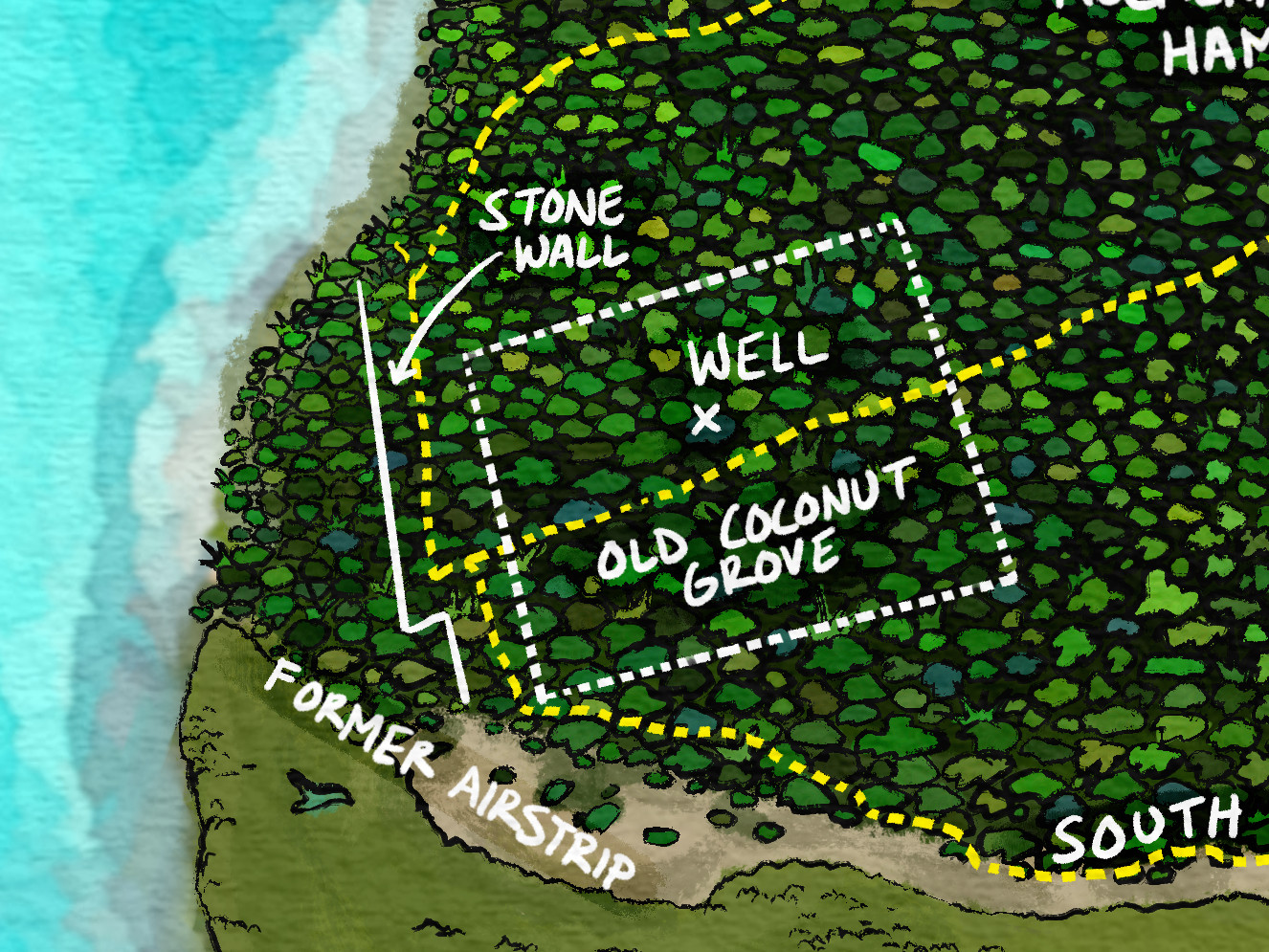
While much of the island’s human history remains a mystery, there is evidence it was used at least to some degree by the indigenous groups of South Florida, including the Calusa, Tequesta, and Matecumbe tribes. After the arrival of Europeans, it was likely a rendezvous point for wreckers and ship salvagers before it went through a string of private owners in the 19th and 20th centuries. These owners added small structures and bits of development to the island, including a former airstrip and coconut grove, as well as the Matheson House that now serves as the park visitor center.
The process of this project was a long and aimless one. Originally, I had been playing around with machine learning and lidar data, testing out the power of feature extraction workflows. Florida is absolutely littered with karst features (i.e. sinkholes) just about anywhere you look, and I wanted to see if these sinkholes could be identified via machine learning. I chose Lignumvitae Key as a pilot area because of its exceptionally holey nature and manageable size.
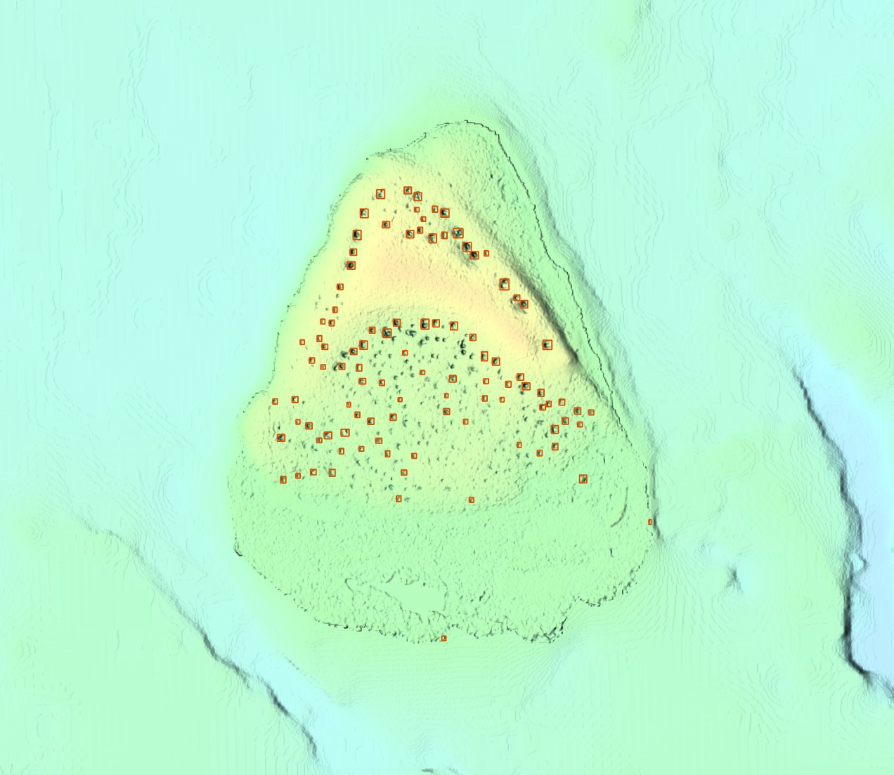
The results of those feature-extraction shenanigans were promising but not great, so I shelved that particular idea for a while. But over the course of those tests, I began experimenting with hillshades of the island’s pocketed terrain blended together with aerial imagery, and then, via one path or another, ended up playing around with the filter algorithms of programs like GIMP and Photoshop, using the big pile of raster data I had now accumulated. So by this point, I had become intimately familiar with the (virtual) terrain of the island, and had gone on endless tangents of reading to boot regarding the surrounding waters, the local plants and animals, and the human history of the island.
At the same time, I was dipping my toe back into the world of digital art and drawing tablets, which I hadn’t done much of anything with in nearly a decade. I’d recently bought a new tablet, and doing a hand-drawn map project felt like the perfect way to break it in.
As with most of my projects, I told myself I would start simple—a very standard park map made over a weekend. But somewhere over the course of that process, I got carried away and ended up doing two dozen illustrations of different plants and animals to fill out the maps borders and highlight some of the wildlife that call the island home. I don’t know how long I spent working on everything total, but it was an on and off project over the course of five months.
The map has a blend of multiple styles. Some of this was probably the result of getting more comfortable with the tablet and drawing program as I went, and some of it was probably just “getting over” a particular look, which happens when you spend months working on one thing. When I started with the island itself, I was going for a more of a comic-book style with black outlines around everything. By the time I decided to do the plants and animals, I had been looking at a lot of gouache and watercolor paintings, and so they came out with a borderless, more painterly look. At one point I considered redoing the island to match the wildlife, but I’d put so many hours into the project already (and those tree outlines in particular), that I couldn’t bring myself to essentially start over. I do think the contrast in styles provides a bit of visual separation between the map and the illustrations, though, so perhaps it worked out for the best.
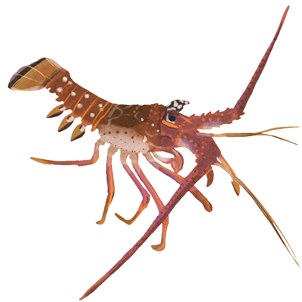
The labels for the island were chosen based on historic maps, the official management plans for both the state park and aquatic preserve, and a couple of research papers that discussed the history of the area. The plants and animals I picked were either officially listed as threatened or endangered in the site management plans or could be considered important to the area (i.e. Florida spiny lobster). I considered a version with no plant and animal labels, but when weighing the trade-off between potential visual distraction and providing more information, I thought the map was more interesting with them included.
The style of the title was the last one standing in a long line of ditched ideas. I wanted it to be big, bold, and watery, but not steal the show. I wanted reader’s eyes to go to the island, first, and I think that separation of styles I mentioned before helps out here, too. The final look reminds me of a magazine cover, which wasn’t something I set out to do, but if any future intelligent fish-residents of Lignumvitae ever want to publish one, I hope they will consider this as a possible cover for one of their issues.