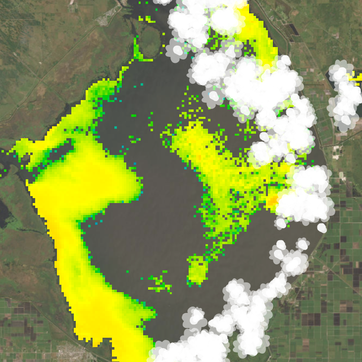
A major environmental concern for Florida and a growing number of places across the world is the occurrence of harmful algal blooms. The Sentinel 3 OLCI satellite sensor maintained by EUMETSAT is capable of remotely detecting these blooms, allowing NOAA’s NCCOS to process and upload data for multiple areas of interest in the United States that are susceptible to extreme algal bloom events, including Lake Okeechobee, Florida.
I wanted to get familiar with multidimensional rasters in ArcGIS Pro and try making a map animation that showcased all the historical bloom data processed by NCCOS. The video above is the final result.
To create this video, I started by downloading all of the available archived data from NCCOS from 2016 through 2021 (the most recent ‘complete’ year available at the time). Next, I wrote a python script to fetch the files in the archives that contained the algal bloom raster data (NCCOS also provides ‘true color’ images for each day, which I wasn’t interested in for this project). I then wrote a second script that performed a pair of ‘Set Null’ workflows and exported the results out to new TIF files. The first workflow filtered out anything from the rasters that wasn’t valid algae data (detected algae are values between 1 and 249). The second step took the original files and removed everything that wasn’t clouds (value 253). So I was left with two new image files for each day—one with only algae and one with only clouds.
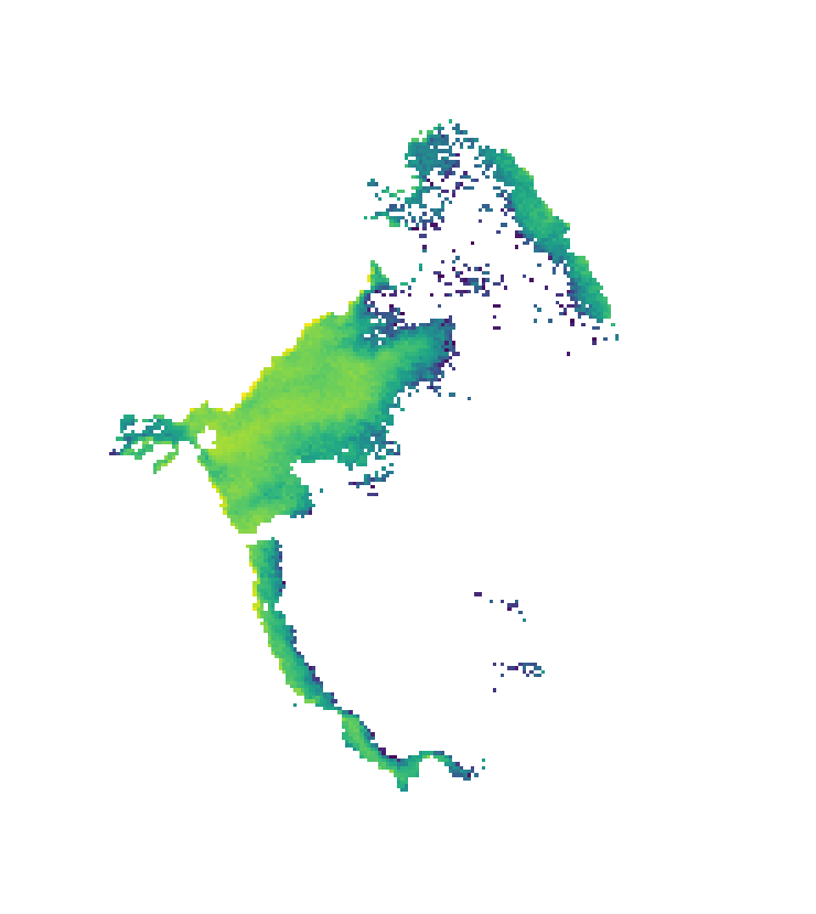
In ArcGIS Pro, I created a new raster mosaic and added the 1000+ ‘algae only’ images I had made. I added a new date field to the mosaic’s attribute table and calculated it with a short python function to pull the date information from each image’s filename (which appear as a field in the raster mosaic). The code block looked something like this:
sentinel-3.2021348.1214.1531_1610C.ab.L3.FL3.v951T202211_1_3.CIcyano.LakeOkee.tif
import datetime

def finddate(filename):
    yearblock = string.split('.')[1]
    year = yearblock[0:4]
    daydate = string.split('.')[2] + year
    value = datetime.datetime.strptime(daydate, '%m%d%Y')
    return value
The bold parts of the red filename above show the date info—in this example, 12/14/2021, along with a Julian day number (348). I added another string field to the mosaic called ‘Type’ and calculated everything in that to have the same value ‘HAB’. This is needed for the variable field when creating the multidimensional raster using the Build Multidimensional Info geoprocessing tool. The name of this field and the values aren’t important in my case (since I’m only showing one type of thing in all my rasters), but a field for value type is needed for the next step.
I converted the image mosaic into a multidimensional raster, using the new date field I made to set time as the “z-axis”. Multidimensional rasters are pretty neat and something I want to play around with more in the future, as time animations are just one of their uses. Making one is essentially just adding a third axis to your raster data, letting you stack multiple rasters on top of each other to represent some other variable apart from your typical x-y directional info. This third axis is commonly time, but height or depth are also useful, if you are working with stratigraphy or ocean data, for example.
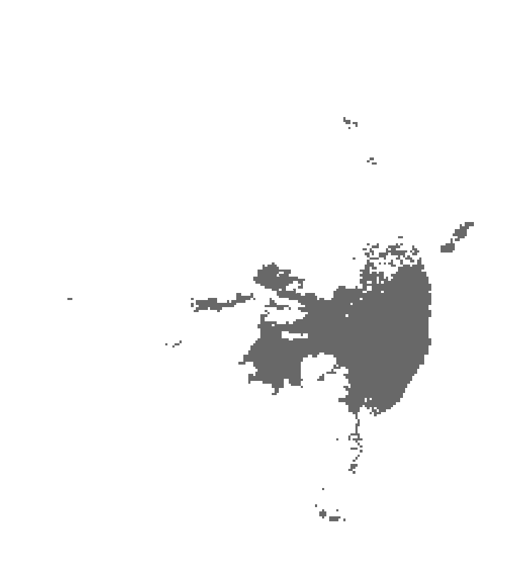
With the multidimensional algae raster complete, I took all of those cloud-only images I’d made earlier and ran them through another python script that vectorized each into simplified polygons and added a date field from the filename, just as I did with the algae rasters. Then I merged them all into a single feature class so I had a massive stack of cloud polygons in one file, each with a unique date attribute.
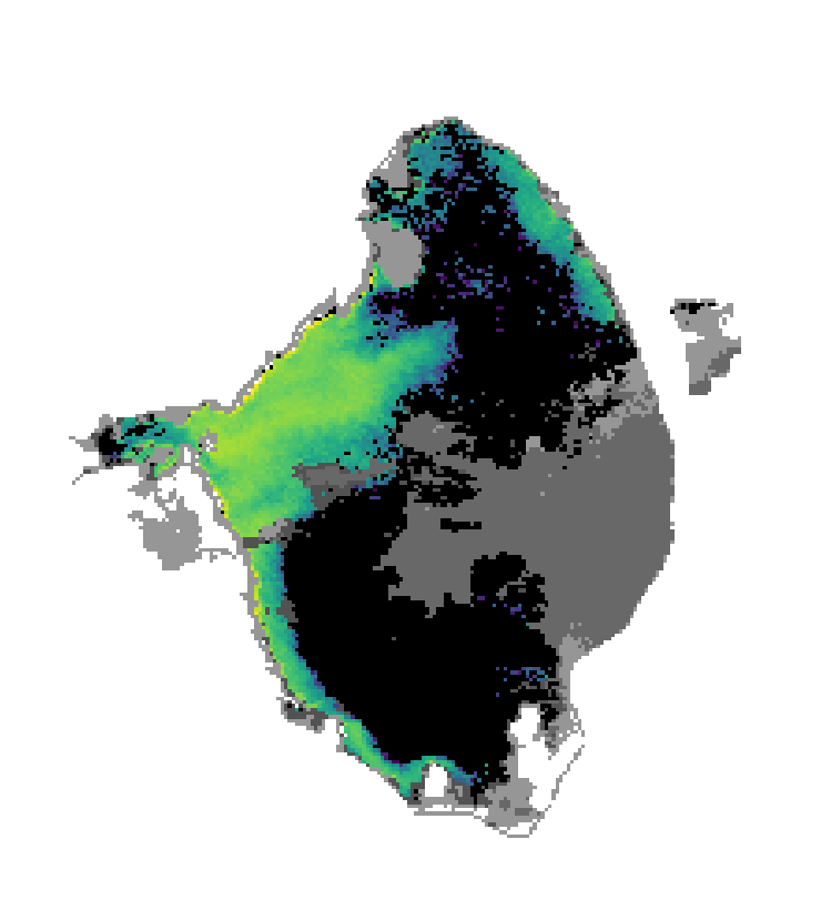
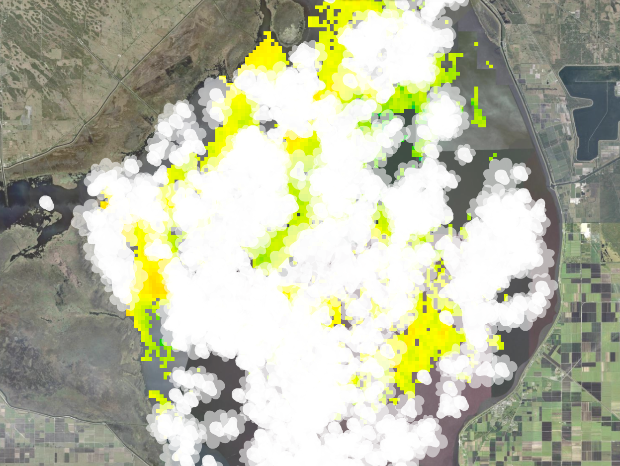
I wanted to try and visualize the clouds in my animation to look more like actual clouds instead of just square white pixels, because if something on your map can be depicted in a way that it doesn’t require a legend to interpret—that’s a design win! Initially, though, I had considered masking them out entirely, but I think it’s important to include them in an animation like this so that viewers don’t confuse a cloudy day with the absence of algae. This way, you can see that (especially during huge summer blooms) massive quantities of algae aren’t dying off and replenishing over the course of 24 hours whenever a storm comes through. Wind is another factor, too, which can make it seem as if large amounts of algae are disappearing quickly, when in reality it’s just getting pushed below the surface of the lake where Sentinel 3 can’t detect it (4mph is the threshold listed by NOAA, which is quite low). A possible stretch-goal for a project like this would be to link up the wind data provided by NCCOS into the animation, too, so that viewers can see when wind might be affecting the amount of visible algae instead of clouds, but I didn’t want to complicate this particular project any further. This was meant to be a weekend project and I was determined to keep it that way—for once.

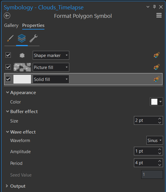
I took advantage of the symbology tools in ArcGIS Pro to get the cloud effect I wanted, using three separate symbol layers. First I created a little SVG cloud icon in Adobe Illustrator and then made a repeatable pattern from it to use as a Picture Fill. I also used a Shape Marker layer to place individual cloud icons along the polygon borders with some variable size to make the edges more natural and then a Solid Fill with some buffer and wave effects to give everything just a bit more fluff and volume. This led to an effect where the cloud edges and the algae pixels have some overlap wherever they meet, making everything look much more natural and cloudy as opposed to having the two layers butt up against each other with straight, discrete lines. This gives you the illusion that the algae actually continues on underneath the clouds (as it does in reality) instead of just halting abruptly.
I used the Temporal Profile tool to plot algae concentration across the entire lake surface over time and exported the resulting graph out to an SVG file. This includes a ‘harmonic trend’ line, which is ideal for cyclical data like this where blooms are expected to surge and recede with the seasons, rather than building up in a linear, cumulus cumulative fashion. I cleaned up the graph in Adobe Illustrator and reformatted the date markers the way I wanted them, since the graph customization options in ArcGIS Pro are a bit limited. I split the graph into two files to help with ‘animating’ it later—one with just the x-axis and dates and another with just the data and trend line. The color bar legend showing algae concentration was made using Inkscape, as I find its gradient tools way more intuitive than Illustrator.
ArcGIS Pro has some animation tools built right in that handle basic time-lapses like this pretty well. I feel like I have to relearn all the little nuances of the time step settings every time I use it, but eventually I got things set (mostly) how I wanted for a four minute time-lapse that showed both the algae and cloud data data for one day at a time. The temporal resolution of Sentinel 3 is almost daily, but not quite, so there are gaps in the animation as it goes through each day. Removing the gaps might have made for a smoother animation, but I wanted the progression through time to be a constant rate to make it simpler to sync up with the graph and prevent a bunch of herky-jerky jumps through time. This is also when I added the title and the dynamic date text for the month and year that changes as the video goes along, which is done with some simple html tags. I exported that out to an MP4 and then finished the rest of the video in Adobe Premiere.
In Premiere, I added all of my harmful algal bloom fun facts (?) at 30 second increments, along with the static elements found on the right side of the video, and I added the static part of the temporal profile graph with with just the x-axis/dates to the bottom. Then, I added the other part of the graph with the data/trend lines to its own video track on top of the time-lapse animation. I set its length to be the entire duration of the video and applied a wipe transition that also lasted the entirety of the video, which was a really quick and easy way of syncing up the graph with the time-lapse and making it look like an animated line, when really it’s just a single static image slowly being revealed from left to right. It’s basically the same as a PowerPoint wipe transition, but real slow. I’d like to learn how to do something fancier with the animations here—maybe have the line pulse with a little blip whenever it enters a new month—but that will have to wait for another time.