It’s turtles all the way down!
The idea for this map first came up while on a visit to the Flint RiverQuarium in Albany, Georgia, where they had a Barbour’s map turtle on exhibit. I sat on the idea for several years until Daniel Wood proposed a #SlowMapChallenge—an alternative to the #30DayMapChallenge where instead of making one map per day, you tackle just one idea you’ve been putting off over the course of twelve weeks.
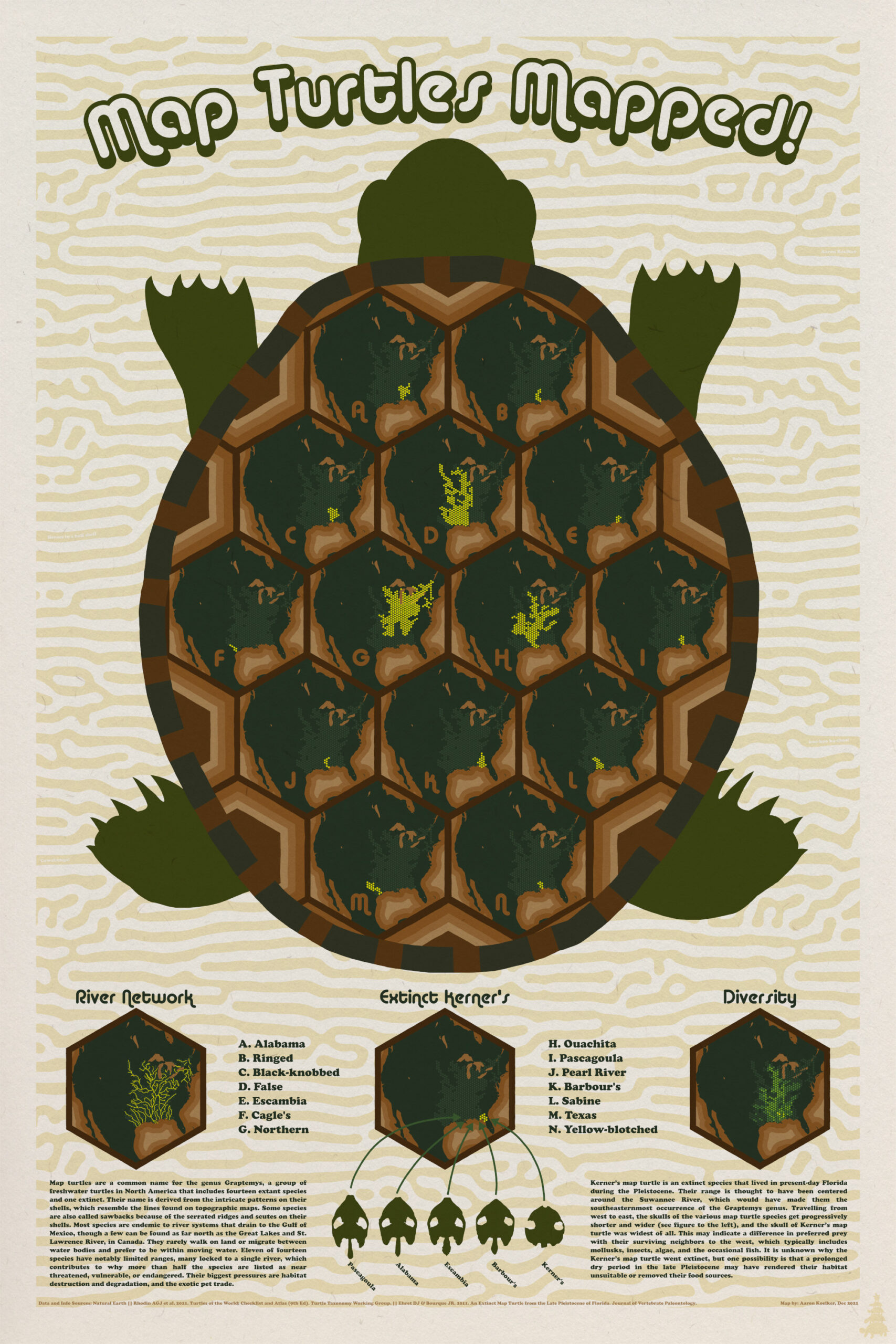
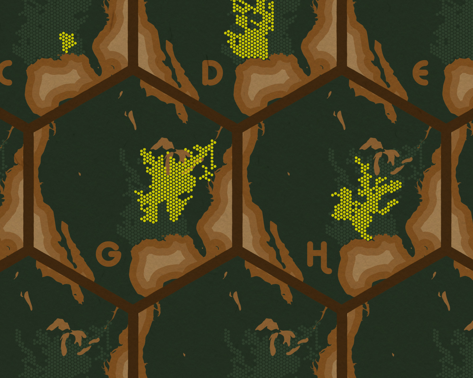
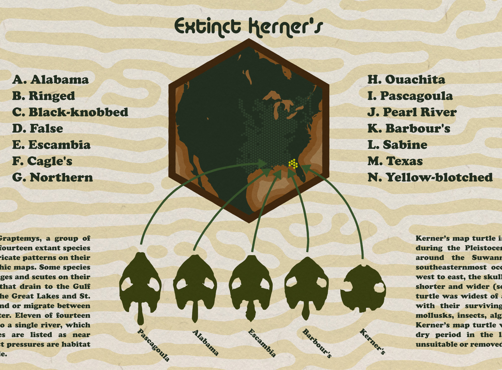
Enter this novelty map of habitat ranges for map turtles—a genus known for the topo-reminiscent patterns on their shells. Each section of the big turtle’s shell shows the range of one of the fourteen species of map turtle found in North America.
The map is, essentially, a giant visual pun—but it’s also meant to raise awareness for a fragile genus of turtles currently facing pressure from habitat degradation and the exotic pet trade. The overall layout is designed to be eye-catching, and sacrifices a bit of practicality to do so, but in prioritizing the theme I hope it makes the map more memorable and keeps readers around long enough to glean some of the information it holds.
Unable to find a consistent digital range data for each species, I eventually turned to the book (and free PDF): Turtles of the World: Annotated Checklist and Atlas of Taxonomy, Synonymy, Distribution, and Conservation Status (9th Ed.), from which I manually (re)digitized the data after quickly georeferencing each distribution map. Not the ideal workflow, but given the scale I’d be working with, was good enough.
The digitizing and “small multiple” maps were made using ArcGIS Pro, but the graphics, text and layout were done using Inkscape (an open source alternative to Adobe Illustrator).
This was the most I’d used Inkscape for any one map up to this point, and I’d estimate a little over the half the work was done in that program—mostly just to see what the workflow would be like. The giant turtle took a long time, especially getting the shell pattern and maps to mesh together.
Perhaps ironically, I think the maps themselves could be the weakest aspect of this project, even though the shell layout was what kept bringing me back to the idea. The intent of using hex bins for the habitat ranges was to match up with the overall hexagonal shell pattern, to get a sort of repeating, ‘turtles-all-the-way-down’ effect. But in hindsight, I think they’re much too small (even when printed at the intended poster size). When I experimented with using larger bins, the habitat range data became too coarse and misleading. I also toyed with using different scales for each map, based on the dispersion of each species, but it ruined the overall shell pattern and made it difficult to tell which regions were being shown. All that aside, I’m pretty happy with how the rest came out. The background especially, which is a Turing pattern generated via a series of blurs and filters that is then vectorized. It’s meant to mimic the skin patterns that some turtles have, such as Barbour’s map turtle.
Although now that I write that, I can’t unsee a bizarre, Ed Gein-esque turtle nightmare.
If you want to learn more about map turtles, this is a pretty comprehensive book I found at a local library: The Map Turtle and Sawback Atlas: Ecology, Evolution, Distribution, and Conservation by Peter V. Lindeman.
The map won 1st place in the Most Innovative category at the 2022 ESRI User Conference, and also has a few hidden turtledoms scattered for those who look closely. You can also find it featured on Maps.com.