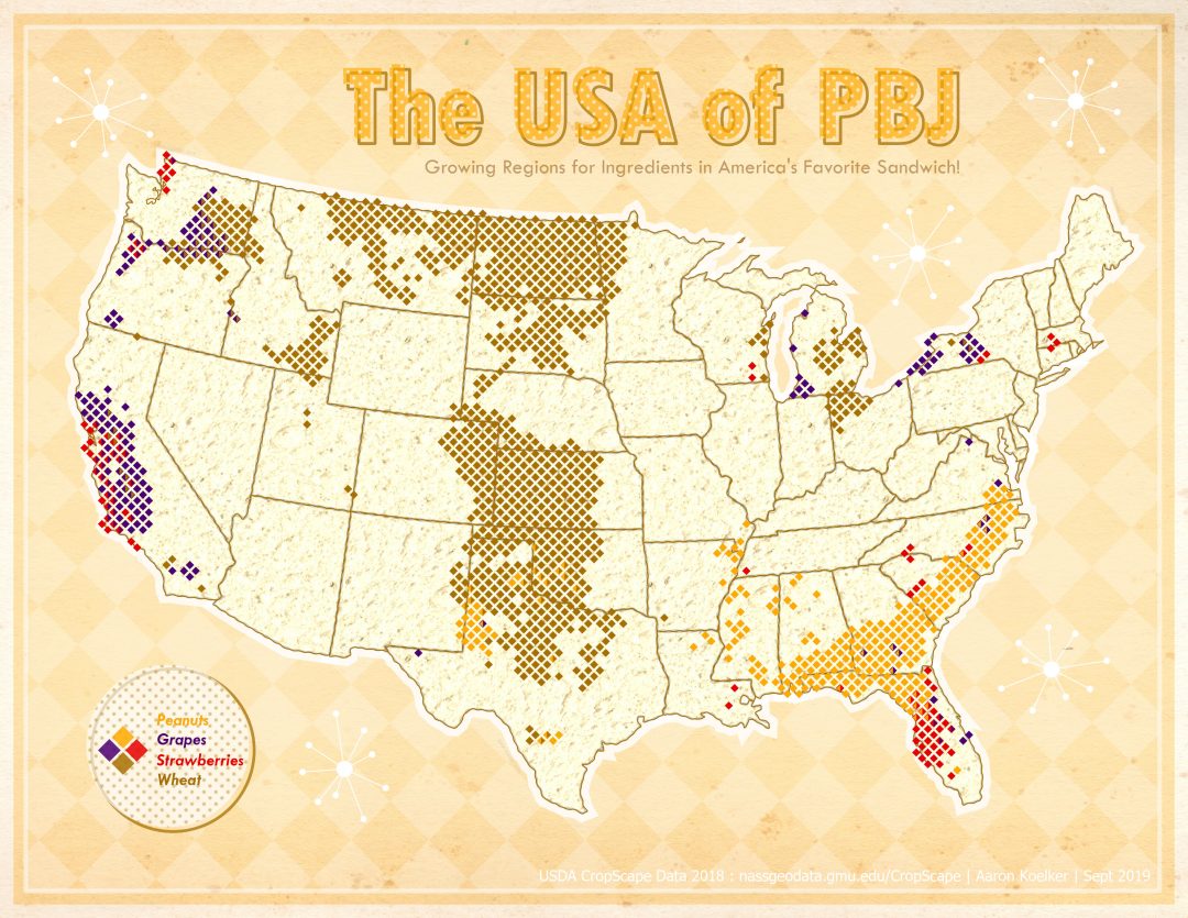
We’re never too old for a delicious peanut butter & jelly sandwich, in my opinion. Using data from the US Department of Agriculture’s CropScape program, I mapped out the prevalent growing regions for some of the major ingredients used to make a PBJ. Originally I was really only thinking about grape jelly, before realized that the nation is divided on more than just politics. I like to use a lot of blueberry and blackberry jam, personally, but chose stuck with the top two here.
CropScape comes as 30 meter resolution raster data, so I first binned the data into a grid of diamond polygons. Hexagon bins might be all the rage, but the diamonds reminded me of a picnic blanket. There were lots of “stray” pixels for pretty much every crop in the source data, so I only represented areas that held an above average amount of the crops I was interested in. I used ArcGIS Pro with a bit of help from GIMP to create the mid-century sparkles and picnic-blanket checker pattern. I also used an image of some bread to give the whole country a bit of *ahem* grainy texture. The polka-dot patterns for the legend and title were made using a pattern fill and offset within ArcGIS Pro.
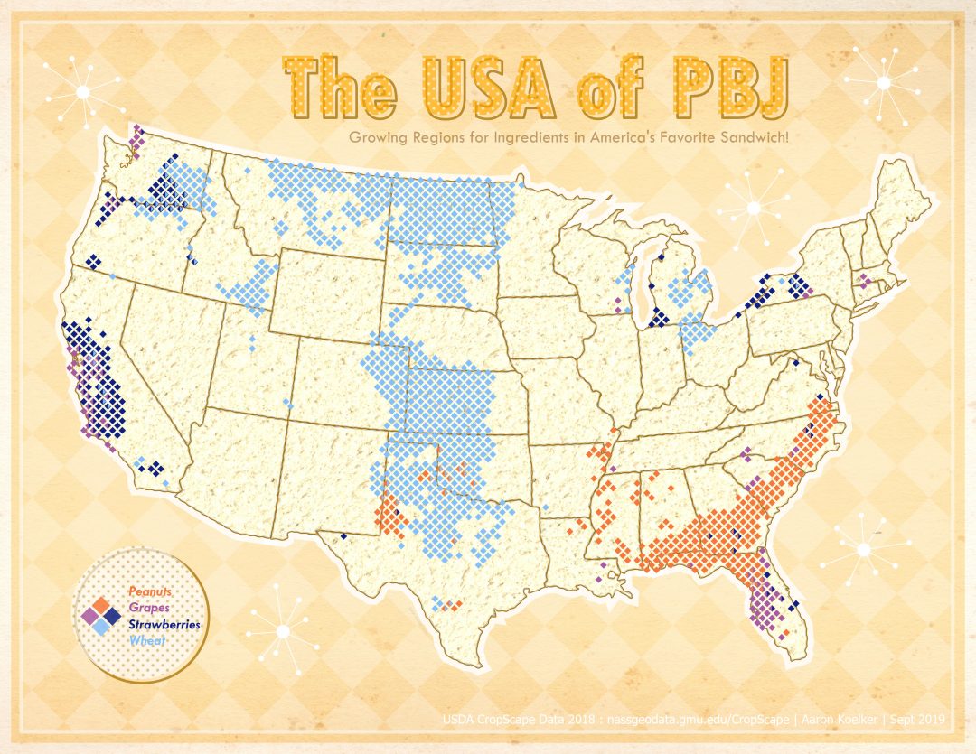
Shortly after sharing, a color-blind colleague helpfully pointed out that the colors I chose made it difficult for them to differentiate the strawberries and wheat, so below is what is hopefully a slightly more color-blind friendly alternative.
